
Above is a mood board for my app that I created before I started. For this project I really wanted to give a great user experience to more experienced runners, as well as new runners. I wanted to have a really clean design that also gave a sense of community and motivated people to use the app with the simple user interface.
Below are the main pages of the app to give you an idea of how it flows.
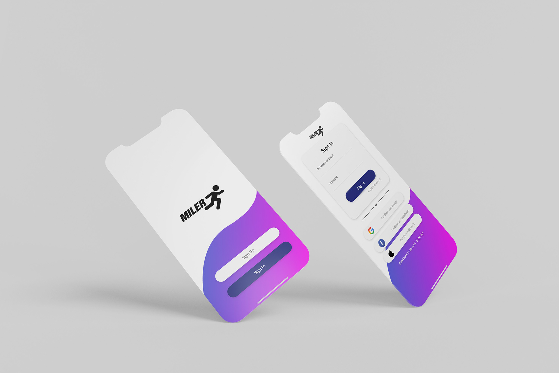
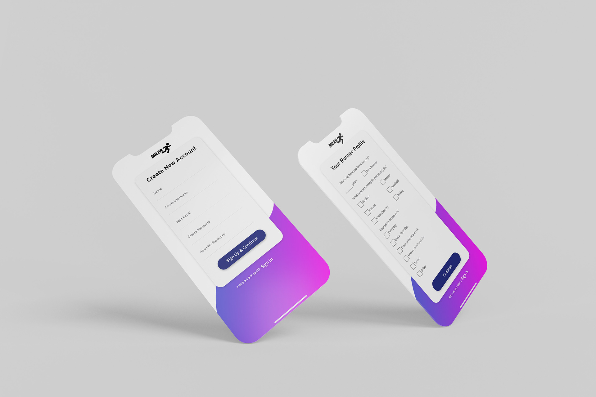
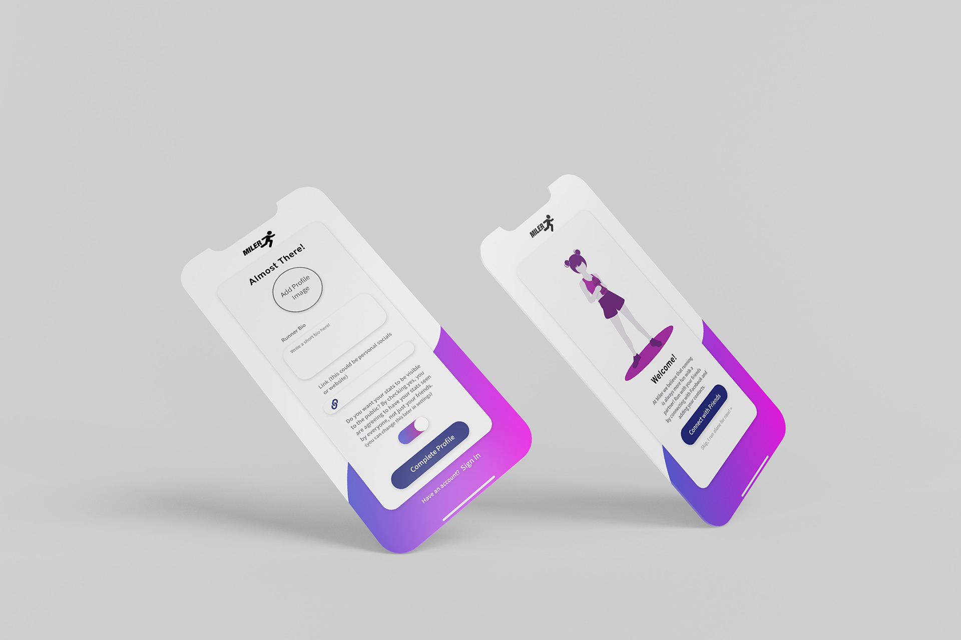
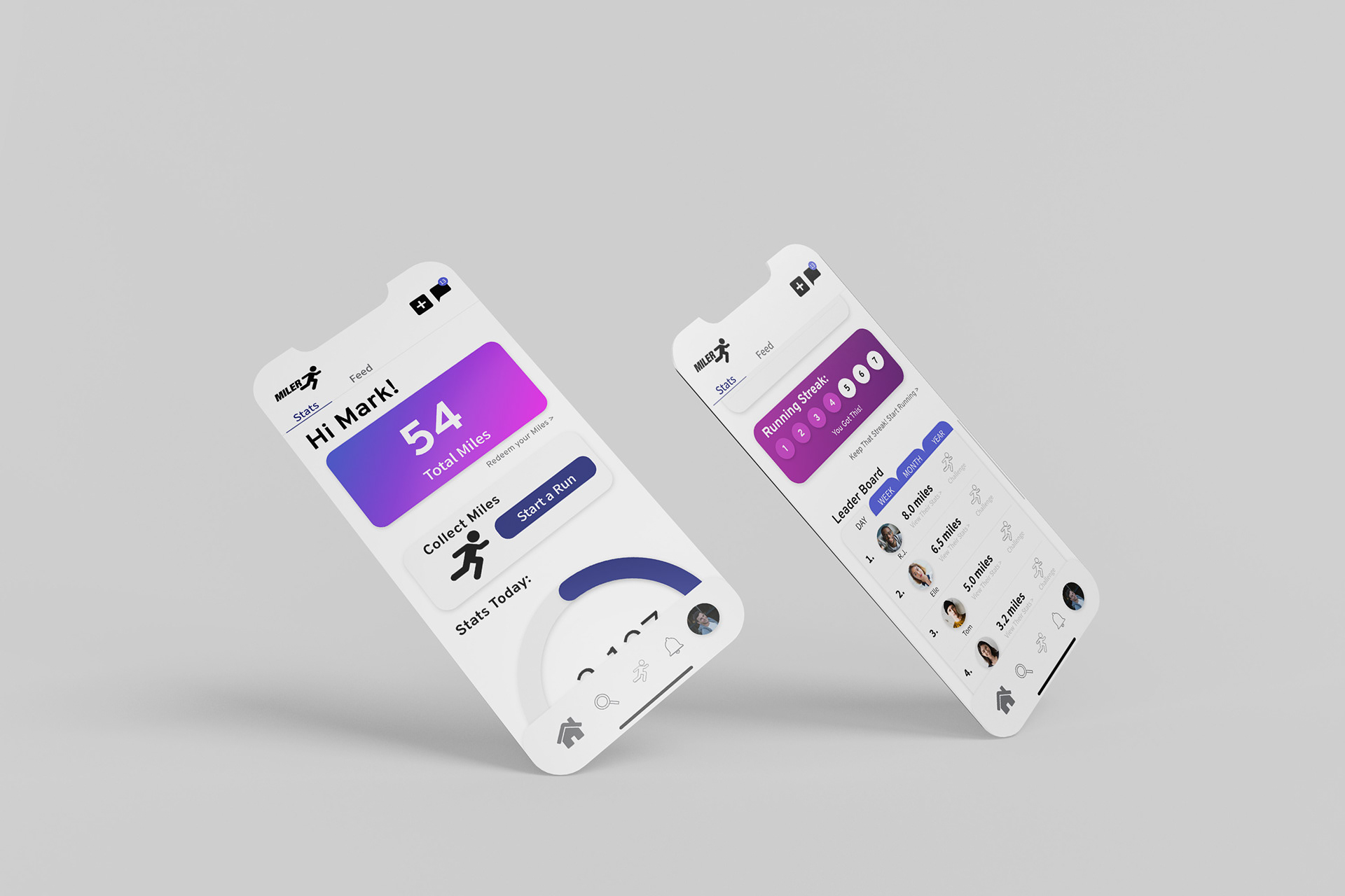
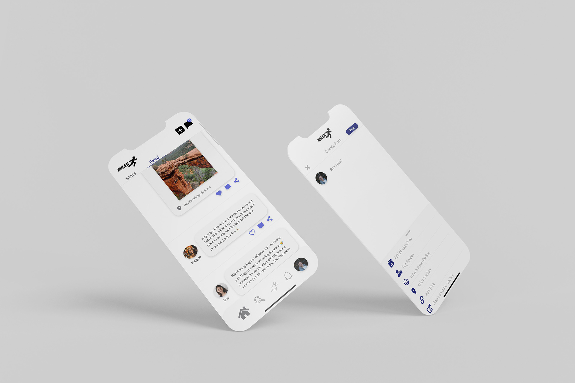
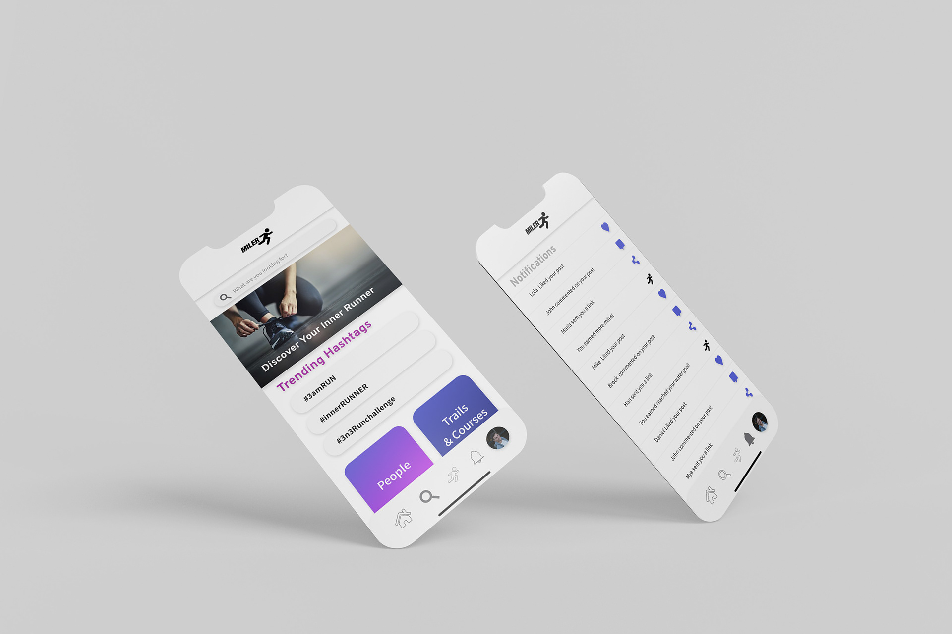
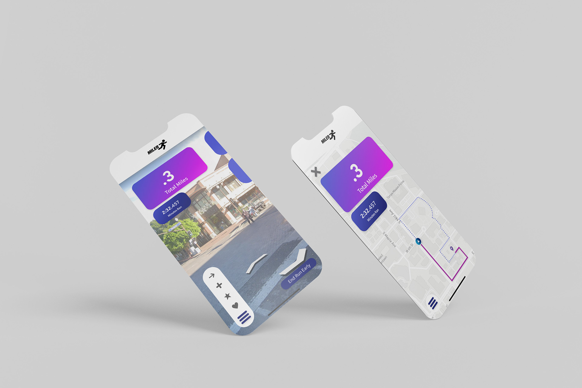
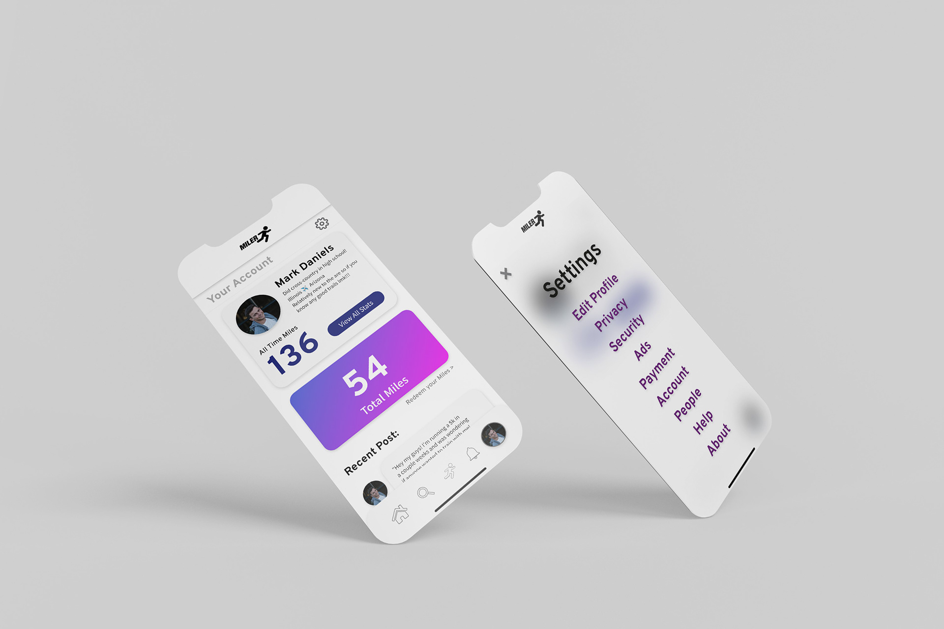
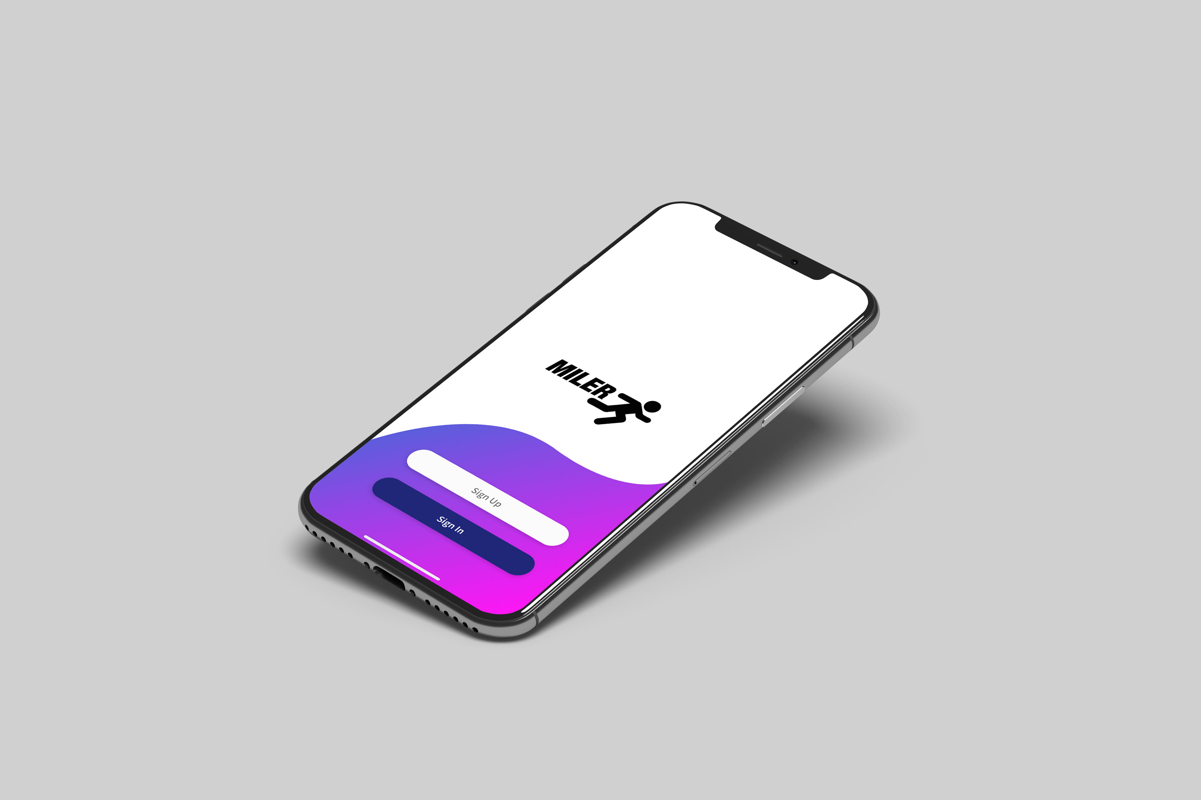
To the left is the prototype of my Miler app. The artboards are all connected so feel free to click through to get the full user experience. There are even some interactive elements in the prototype to discover.
Below is a look at my artboards and the flow of my app all together.

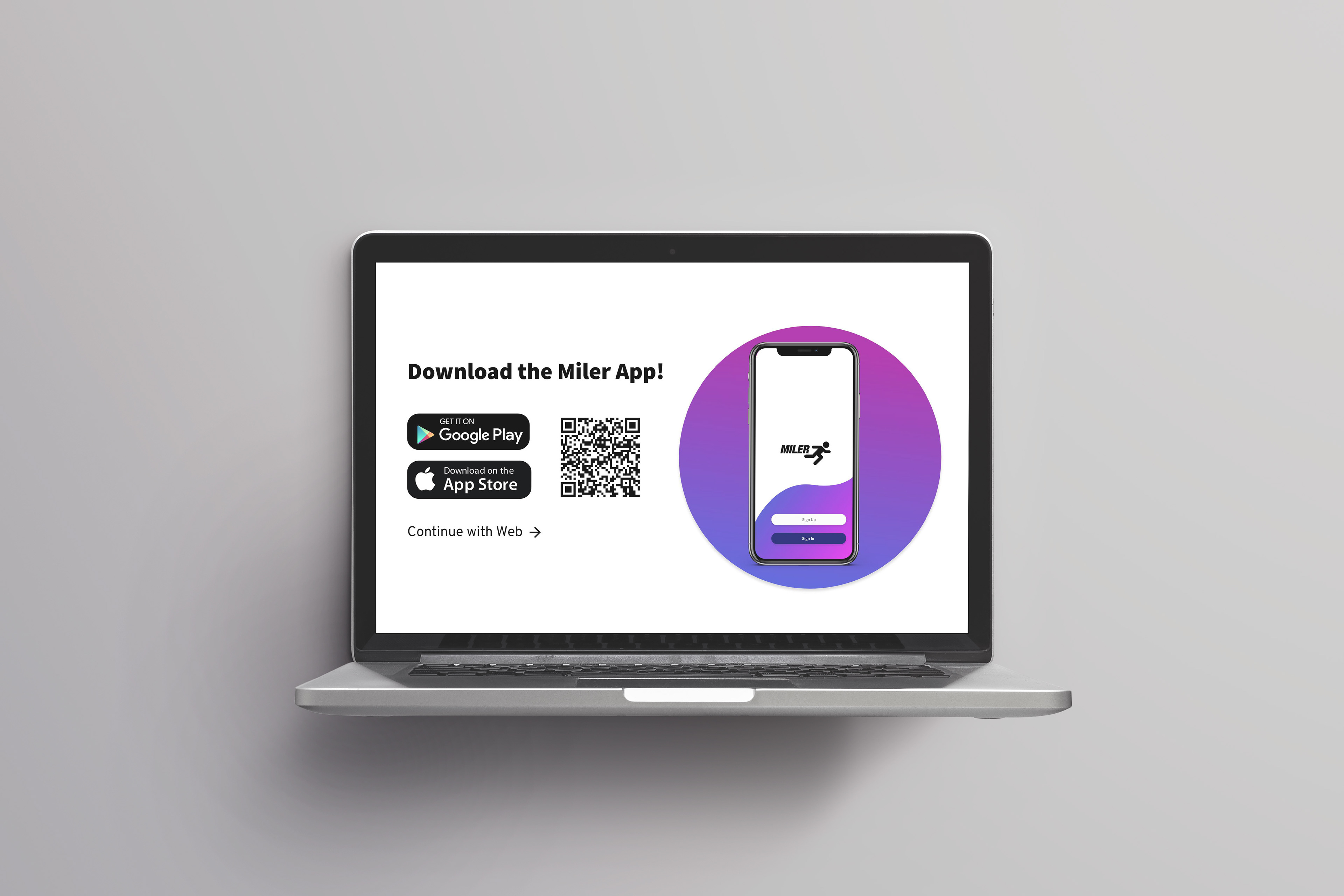
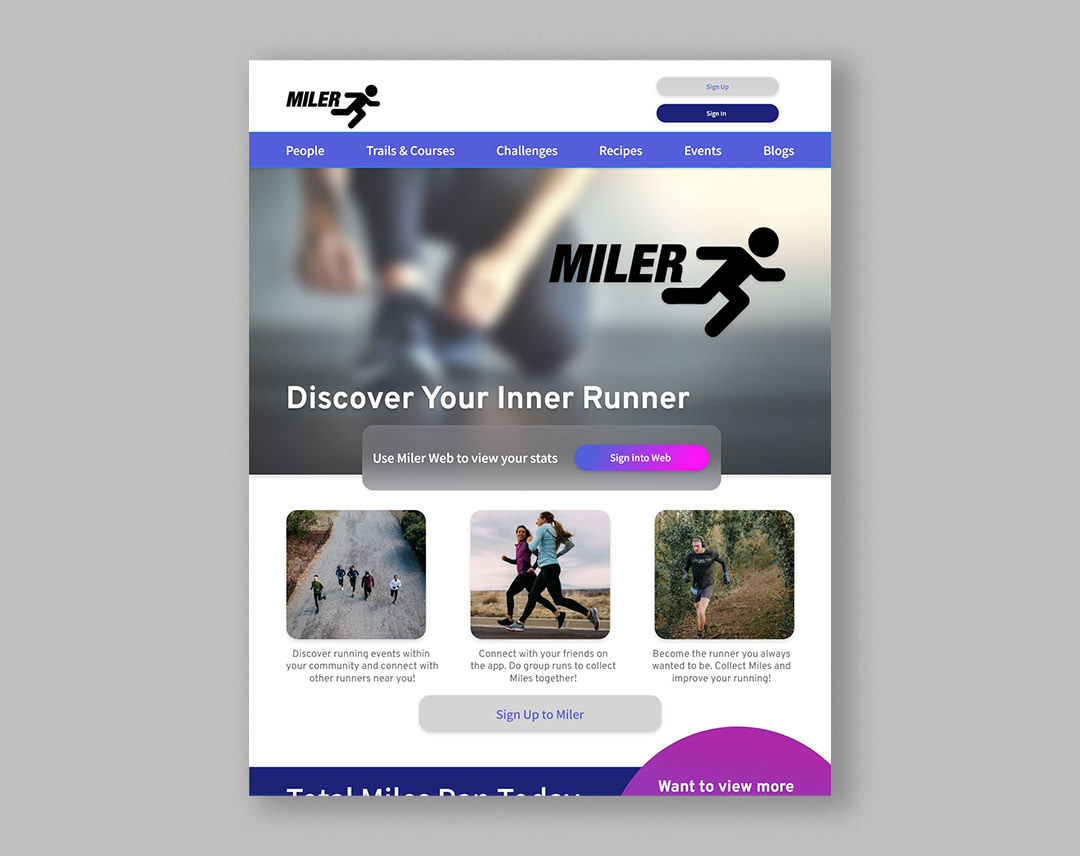
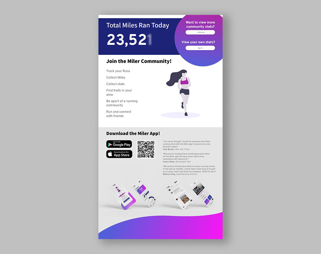
As well as an app, I designed a webpage for those who searched Miler on the web. I wanted this to be a page that encouraged those who have the app to get download it. I played with UX really influence the viewer to want to download the Miler app.