Below will be six different inside spreads where I explored different layout ideas.
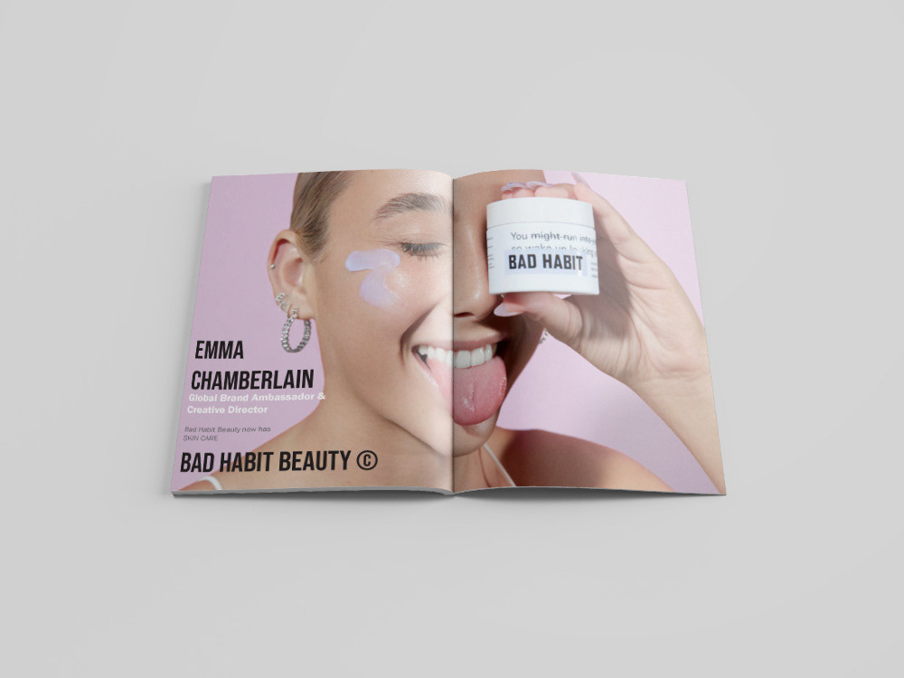
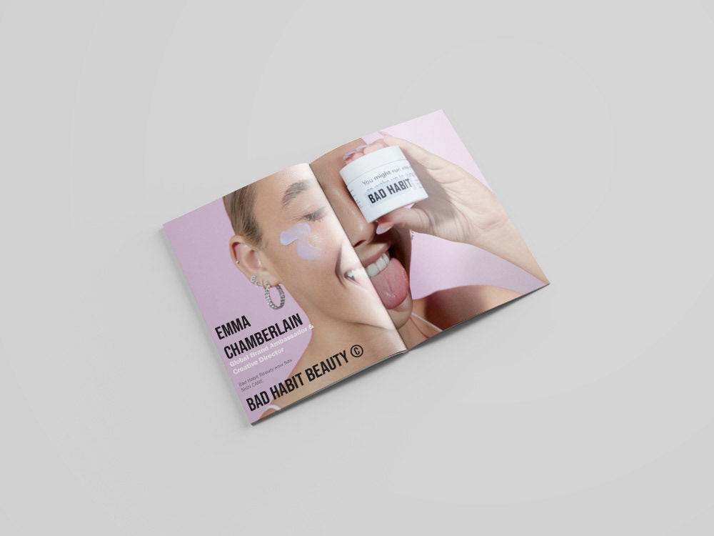
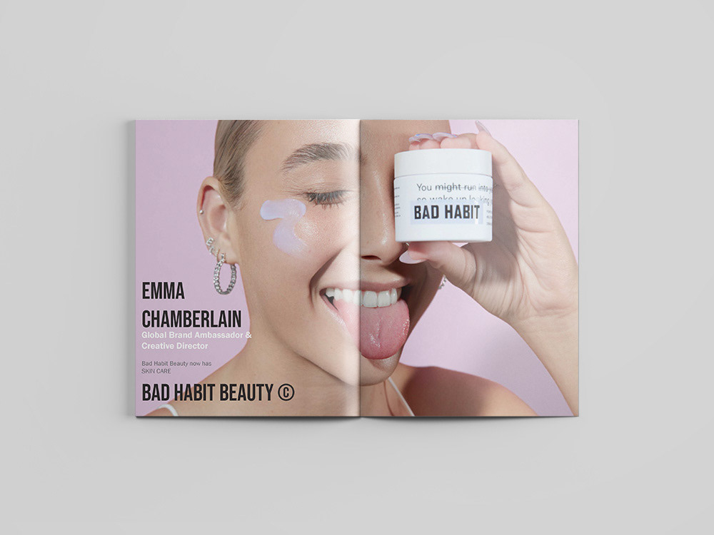
Spread 1 - A Bad Habit ad exploring making spread across the two pages. I also played with the hierarchy of the type and how the different elements of typography in an ad interact with each other.
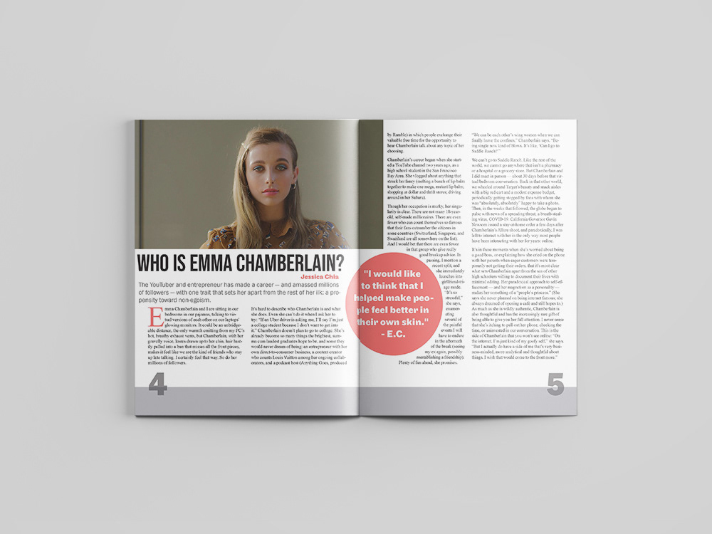
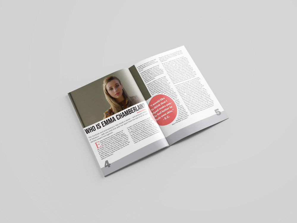
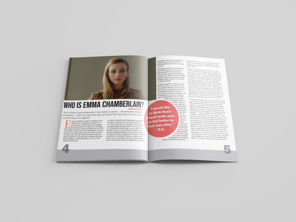
Spread 2 - The first article I created explores how I dealt with wrapping text around objects, hierarchy with type, and putting small but effective details,
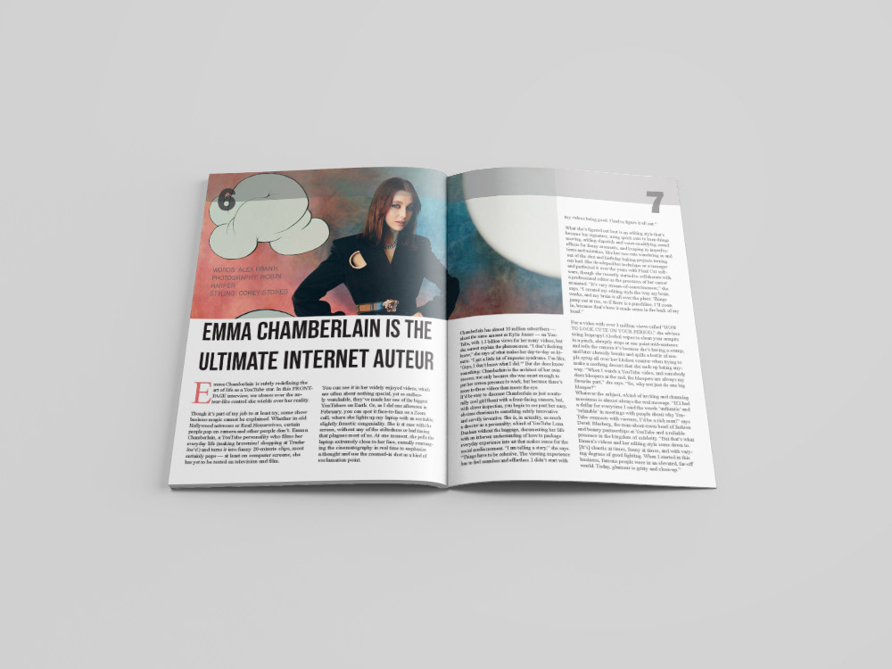
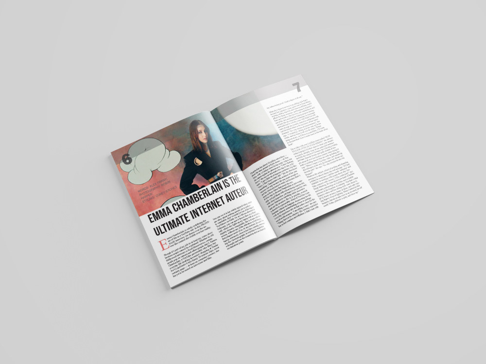
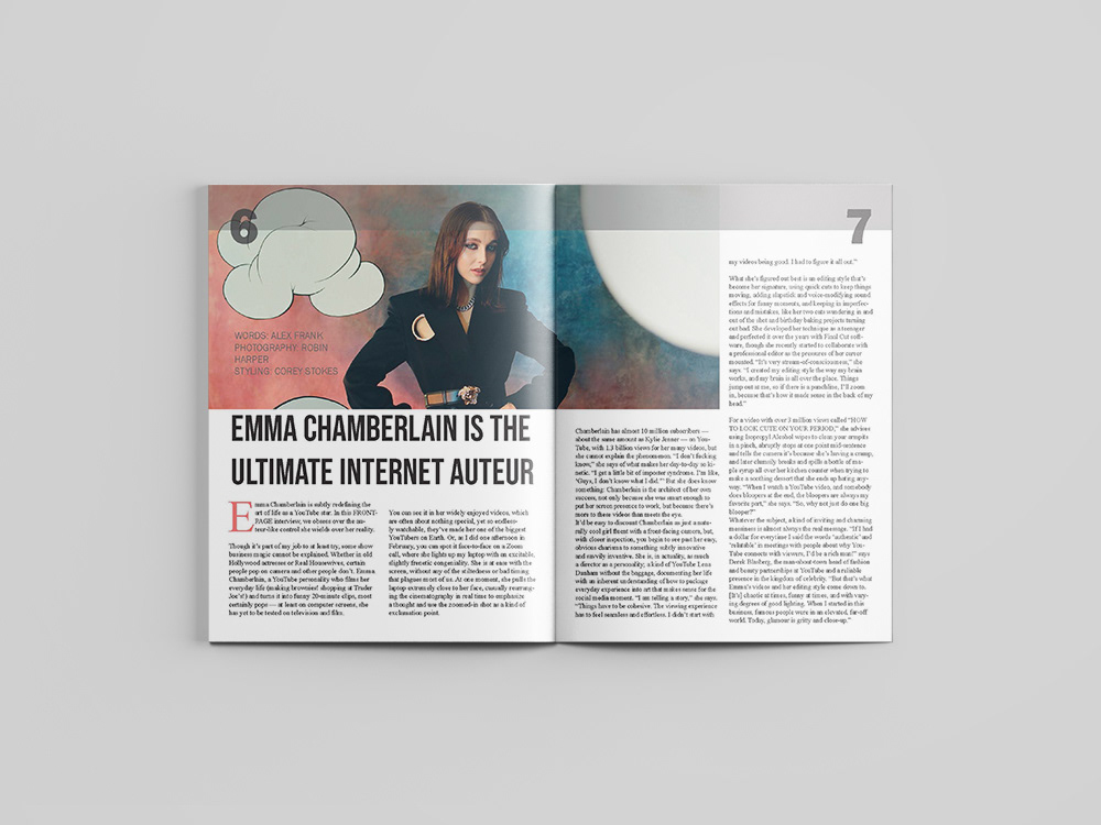
Spread 3 - This is the first page of my three spread article. Outside of how I dealt with the type across the text boxes, I focused on where to place details like the author of the article so that they can still be read but not fully taken away from the article.
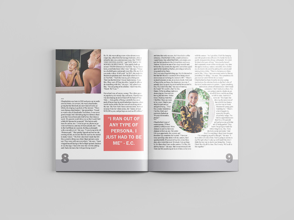
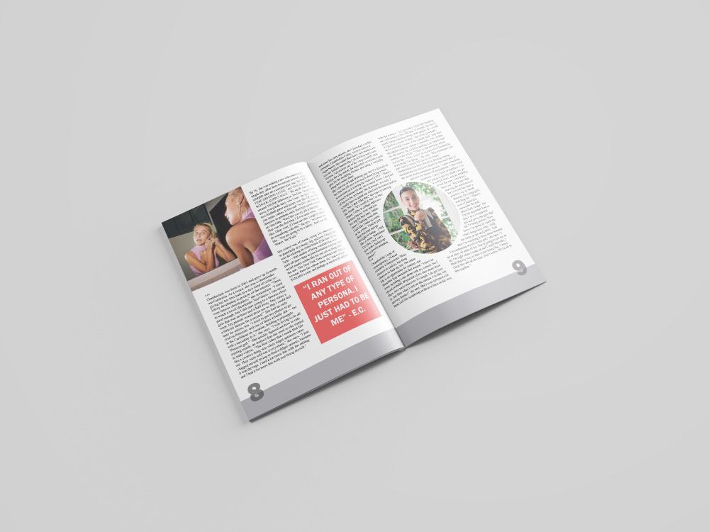
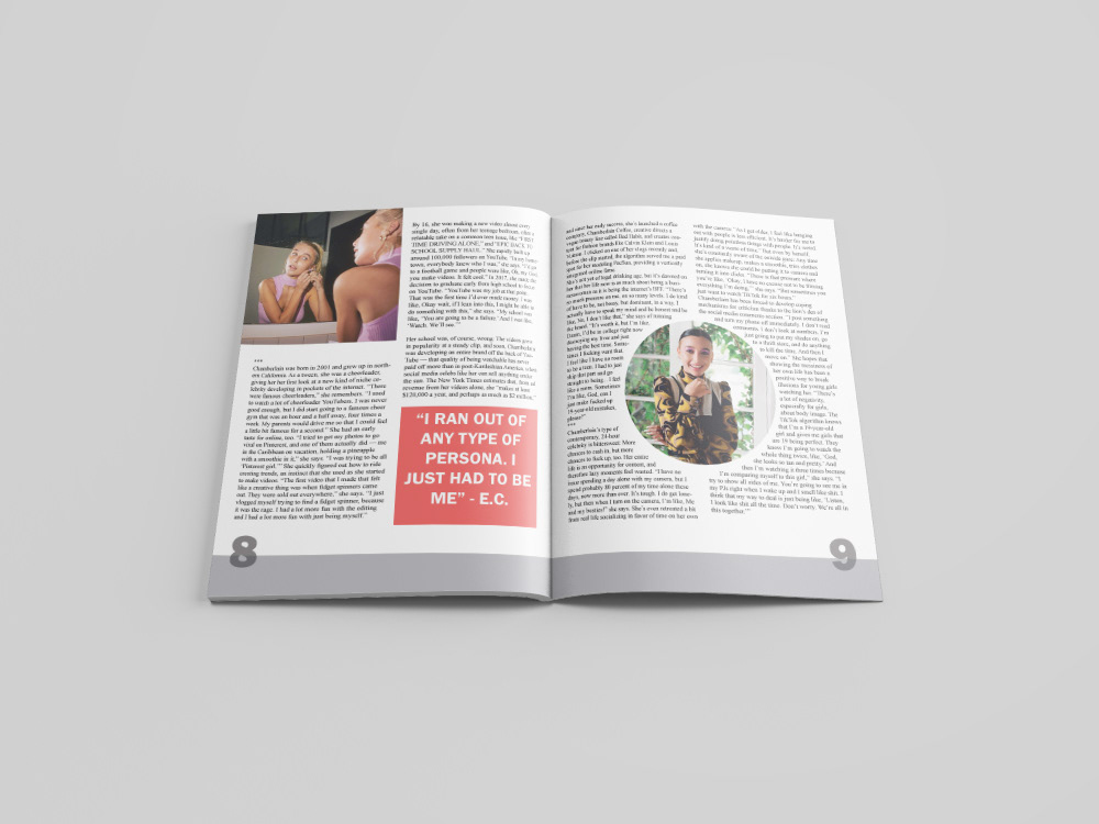
Spread 4 - The article is continued here. For this spread, I focused once again on how I want to wrap the type around my objects and how to place photos and quotes without it becoming too busy.
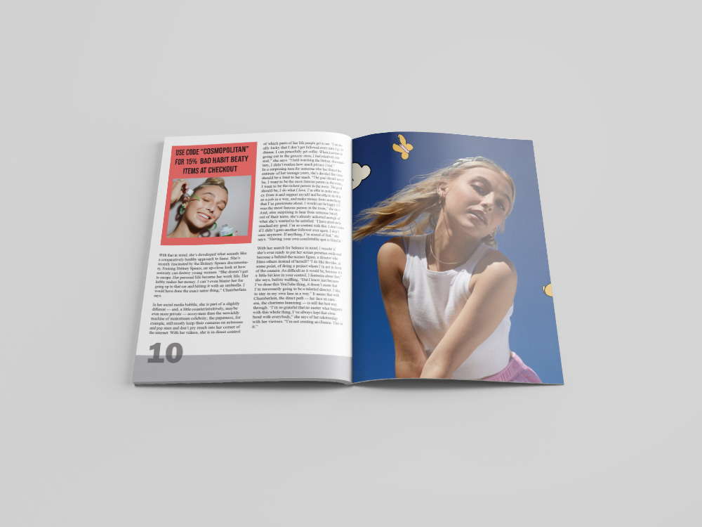
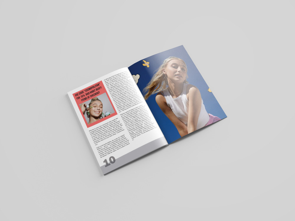
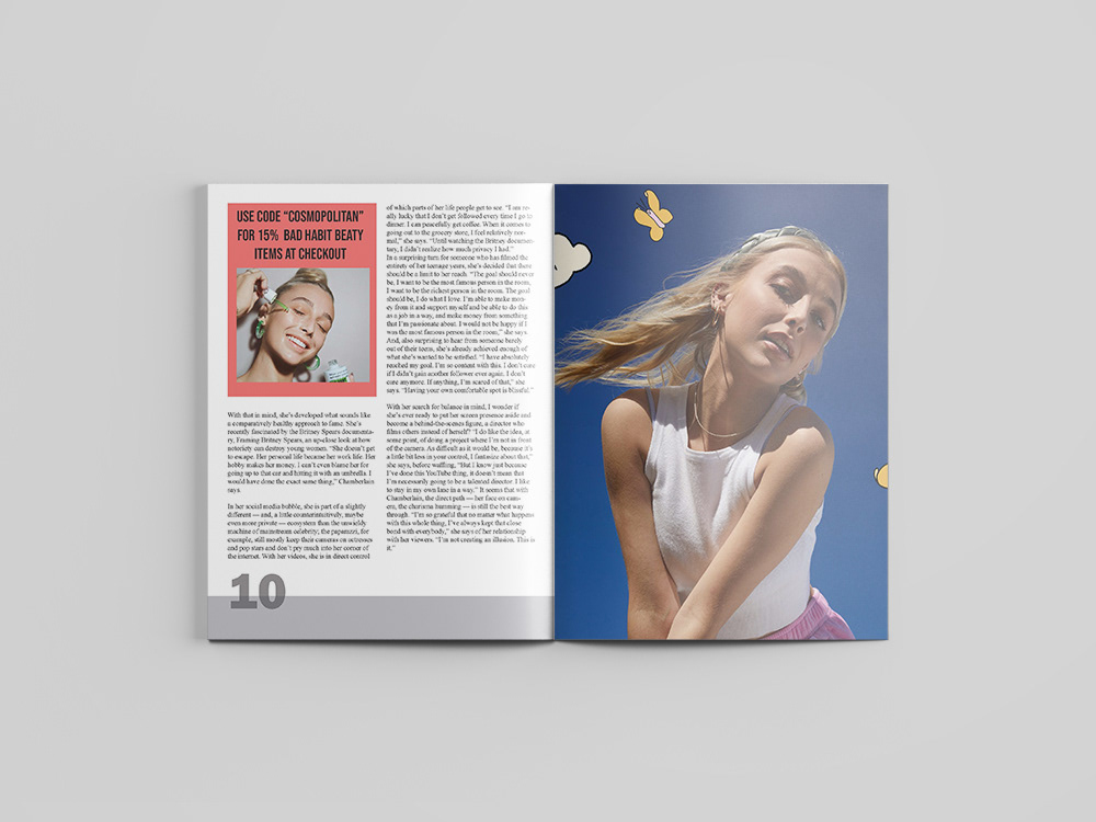
Spread 5 - This is the last page of the article and with it only taking up one of the pages, I wanted to explore having a full-page image and how that might interact with the type.
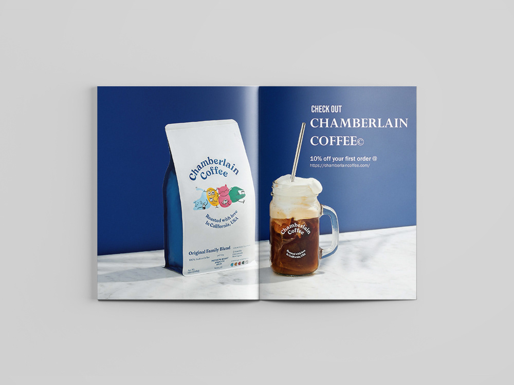
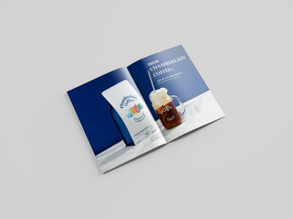
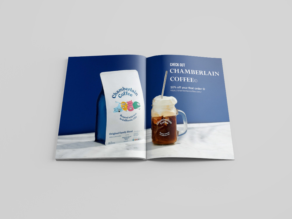
Spread 6 - Similar to the first spread, I created a full-page ad because I found these can be very interesting and effective after I tried it with my first spread. Once again I also played with the hierarchy of the type and how the different elements of typography in an ad interact with each other.
This project allowed me to explore many different layouts and how to have many different elements of a magazine interact with each other.
